"MY 'SECOND CHANCE' PORTFOLIO" (c) 2015...and most recent example landscape graphic art.
INDEX TO WORKS NEVER FRAMED, NEVER EXHIBITED.
For more about the artist click here.
Online art and compositional exercises: Landscape re-emerges in 2019, taking post-impressionist graphic art into a new realm!
Reviewing one's own work is a very interesting undertaking.
Especially those works that you considered not fit to exhibit
previously...
When you scan in your studies it is almost always necessary to
crop them in order to fit. Therefore, most everything on this page are
"details." However, this exercise actually creates a new
work. As an artist you are redesigning your original vision.
It helps to have decades worth of work to review - you really don't
remember why you made a mistake with the composition. It is for me not a case of just cropping out a "mistake" from the technical painting aspect (I've tossed those years ago). Rather, it is for the most part because I work "flat" in
watercolor and this can at times cause distortions in compositional
terms (among others).
So in the spirit of a "Second Chance Society" I have created this page to display reworked designs!
I N D E X
T R A N S I T , T R A N S P O R T A T I O N A N D T R A F F I C I N C L U D I N G MA P S A N D M O R E U N F R A M E D L A N D S C A P E
S T I L L - L I F E
F I G U R E S A N D G R A P H I C P O R T R A I T S
B U I L T E N V I R O N M E N T
P O L I T I C A L A N D O T H E R C A R T O O N S and link to 2016 Election Cycle cartoons HERE;
G R A P H I C I N T E R P R E T A T
I O N S O F O U R
O W N W O R K S;
A N E W P O I N T I L L I S M...
T R A N S I T
, T R A N S P O R T A T I
O N M O D E , A N D T R A F F I C A N
D S E N S E O F P L
A C E ;
B U I L
T E N V I R O N M E N T , A N
D . . .
L A N D S C A P E


Weston CT is all about schools - and school buses. I start
with this study, which might have been an attempt to imitate John Sloan,
but ended up looking more like John...Marin!
Next
is an assignment to paint what you think the senses should look
like. In the watercolor assignment was a failed version of "sound"
if
memory serves - a detail of an AMTRACK locomotive.
LINK TO YUKON LINE. The New Canaan
Tea House of a dear friend was only reachable by Japanese
bridge (not shown)...and my
minds-eye map of the upper west side of Weston dates from the 1980's...and
this Fall is time to walk all town roads - but not in these (r)
boots!


THE FIVE SENSES: Sound (waves breaking); smell (summer in the city); sight (my mother had eyes in the back of her head); taste (yummy) and touch (down) or on the links...
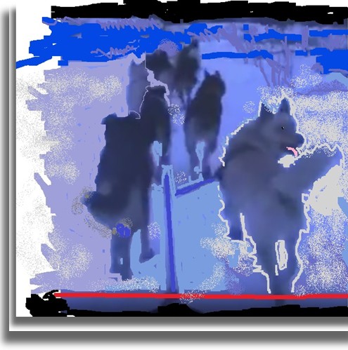
COLOR IN LANDSCAPE YEAR-ROUND: MIXING GREENS - THE YUKON QUEST SLED DOG RACE ENVISIONED -
NORTHERN LIGHTS, ALASKA AND THE YUKON (A DIFFERENT PLACE FROM WESTON CT)


IDITAROD XLIV TOOK THE SP KENNEL RED TEAM AND SLED ON A DRAMATIC TRIP
ACROSS ALASKA THAT RED TEAM LEADER SHARED IN VIDEO, FROM WHICH THE
GRAPHICS BELOW ORIGINATED


WATERCOLORS AFTER HOMER'S "BLUE
BOAT," SIMPLIFIED. GRAPHIC AT LEFT.


LIGHT FROM NATURE
Sunlight varies and is never more dramatic than in landscape painting,
whether in watercolor or doing a computer graphic of the snow you have to
capture the alive and
immediate character of color and shades of
color. All colors are included in light or white, so painting snow
is...electric (see Alaska graphic examples above)! We notes that
the amount of "light" during winter in Alaska is...not too much, so it
is always a thrill to see it.
Traditional water colors: Immediately above - "Blue Boat" series, in order of when
these were done - first attempt
(detail); next, the second (detail) and at the right, also on our
other art page, the essence
of what I had learned from the others!


G R E E N W I C H P O I N T P A R K
One of the things I found out while working "en
plain air"
during a day painting with Hannah Ferenbach's afternoon group at
Greenwich Point Park was this: Besides now having to be afraid of
Zika virous-bearing mosquitos...having to work quickly to
not miss the moment and its light, on a sunny day at the beach, my #2 H
(hard) pencil's lines were useless and invisible! Just as well -
using a pencil only
slows me
down!


C O L O R A N D L I N
E A S W E L L A S
B L A C K
A N D W H I T E
Here we are in the 2016 still looking for a new technique to test the economic wind - definitely not the horse-and-buggy
age! With dry real estate to be at a premium at some time in the
future if global warming follows the model, we offer these quick
sketches of transportation modes n'map. We used Microsoft
Paint varied palette... our version of creative thinking above:
Four examples of
transportation-related subjects or objects, and how we make use of tools
at hand!
M A P S E C T I O N


If you are a planner you have to have a map, as one former boss of mine
put it.
So begins another sub-section of this "Second Chance
Portfolio!" We note that these "maps" altho' not exactly done with
straight edge, are to scale, approximately. In addition, please
note also that the transport-related topics lending themselves to
mapping are not exactly intimate scenes - like still-life!
S T I L L L I F E


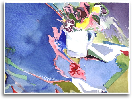


Celebrating special objects or imagining them works in graphic
form!
Still-life isn't all fruits and vegetables and is very tough
to
compose. Try picking objects at random sometime! All
white or all transparent set up - or perhaps with mirrors - these, too,
are still- life!
Painting still life is easier than painting people. Try doing a
still life with objects that are white and grey - so many different
shades! Is very instructive. And that goes for still-life in
general! Alto' it may be "easier" in some respects, it is a
challenge. Since the fruits, vegetables and objects don't take
"breaks" you have a bit more time to use and can get intellectual about the subject if you want to!
However, a person can
use close observation of objects including texture, drapery (very tough
to do) and characteristics of other materials as
a test. Many times you might just like part of a still life, and
so you might just attempt part of it - and that's OK! Still
life
gives you the opportunity to make the ordinary not so ordinary.
Setting up your own still life is difficult!!! It helps to use
your favorite and/or significant
objects. Which is, in my opinion, the secret to creative still
life execution! Reflections are tough to do, too.
One of the nice things about
studying with a gifted teacher is being forced to stretch your
compositional thoughts. Setting up a still life required lots of
thought, excellent specialty lighting and perhaps most important, as was
done at the Art Student's League as well as Silvermine School of Art,
distributing excellent fruit and vegetable "models" after class was
completed!


It is like the old joke: "How do you get to Carnegie Hall?
Ans. Practice. If memory serves, Carnegie Hall is very close to the Art Students
League, but I digress...
Still life can be really satisfying to paint if you care about the
objects or if they evoke an emotion. For example, a yummy still
life that got consumed, is one way to select objects. "Bring your
own objects" for small set up for yourself is another exercise.
This type of project clearly brought out my secret trompe l'oeil
persona. When you work in watercolor it is often best to start
more than one painting at a time, or as necessary, in the case of the
"oops" moment when you've made a mistake that can't be easily
"corrected" - in any event, I was taught to always do several paintings
of the same subject whenever possible.
Sometimes your "first take" is the freshest and best, and other times
you learn that you tried too hard, or included more information from the
still life than you needed.
Always be an editor - every piece of information in a composition is not
equally important to what you want to end up with in the final work -
which is why sometimes the second or third painting of the "same"
subject comes out expressing what you wanted to say about the set
up! When in doubt about what to do next or where you want to end
up, do another version. Come back to the first version later - and
more times than not you'll find that after the paint dried on your first
try, it either looked fine except for needing a line here or there, or a
bit of staining color mixed to be very dark for emphasis.
Sometimes you just can't do an object justice - as in the case of this
Emerson Patriot Catalin radio designed by Norman Bel Geddes in
1939. Which was not in "mint" condition (Catalin plastic-like material fades).


MY RED PERIOD
I went through a phase where I just painted how I liked - bold and not
waiting to think too much. Line became very important.
Sounds like good watercolor
technique! If you are not using multiple washes and the blow dry technique
described below, you'll probably like "rough" paper in a watercolor
block (don't forget to develop the proper technique for removing the
finished painting so as not to rip the paper). I use my Grandmother's cake knife.
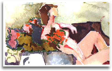
F I G U R E S
I N C L U D I N
G P A R T S O F P A I N T I N G S
N O T R E A D Y F O R
P R I M E T I M E A N D
G R A P H I C P O R T R A I T S


Most times things that you enjoyed painting are not worth
framing. That is, if you are interested in selling. When you
get a chance doing the figure, try the pose from different
perspectives...don't be lazy, move your painting set up if there is a
spot that gives you a different take on the pose!
Painting the figure can vary from a Matisse-like
approach where the background is just as important as any other sector,
to line
drawing; and how about 5-minute poses? You learn the
importance of
line as an element every bit as important as...color? So I just
enjoy my time painting two-legged and four-legged creatures (see below),
and use it
as a test of close observation and trying to not use any extra brush
strokes! These at the top right were one-minutes poses...the row below
contains parts of paintings (that fit on the scanner) that each had
something about them I learned from, left to right: 1)don't add
what you can't see 2)great cloth! 3)an example of when to
"do
another" and remember to look a little closer next time and 4)now
I got it right - guitar and guy are one! And then, for the nudes,
5)bingo
- I got the pose, which was tough - but again, added too much
information that may or may not have been there.
SOME ADVICE: The
drawback to watercolor is its costliness when it comes to mounting an
exhibit. In order to not damage the art, you need to use "acid free"
matting (more costly - but otherwise glue used in regular matting will
stain the paper). And I've tried to keep all matting in uniform white
(there are many "shades" of white - I prefer cold or blue as opposed to
"warmer" tint
when exhibiting plus I use simple silver frames - and then there is
or was glass -
I've been using unbreakable UV-non-glare acrylic material over the past
decade) in shows. Of course, the works on this page never have
been framed or exhibited!


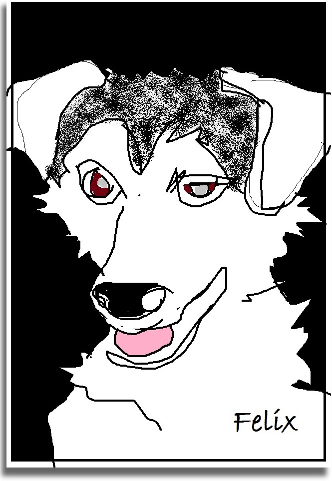


AND THEN THERE IS TRYING TO DO A PORTRAIT OF SOMEONE WHO DOES
NOT KNOW HE IS SUPPOSED TO SIT STILL! TRY PUPPIES!!! DOING A PORTRAIT IN
WATERCOLOR IS TOUGH ENOUGH!
Who has four legs and doesn't sit still?
Man's best friend, for one. The trick? Find a good looking animal named
"Champion Charlie the Golden Retriever" and you can't miss - BUT please
take your own picture and scan it in in black and white as well as
color!
This is one way to avoid that dead look you get working from another's images.
Not
to mention that using another person's photography is illegal - although
you probably won't get caught unless you get noticed and people
pay money for your work, it isn't a good idea anyway, because the
photograph and its composition isn't in
your mind's eye - you
might have
taken a different picture of that same scene or person!
Perhaps
if you have a connection to the animal, another's photo is going to be
satisfactory, as in these "portraits" of magnificent leader Quito,
sister Chica, Felix, Willie, Clyde (twice), Beemer, Schmoe, Scout,
Olivia and her Mom, ChaCha.
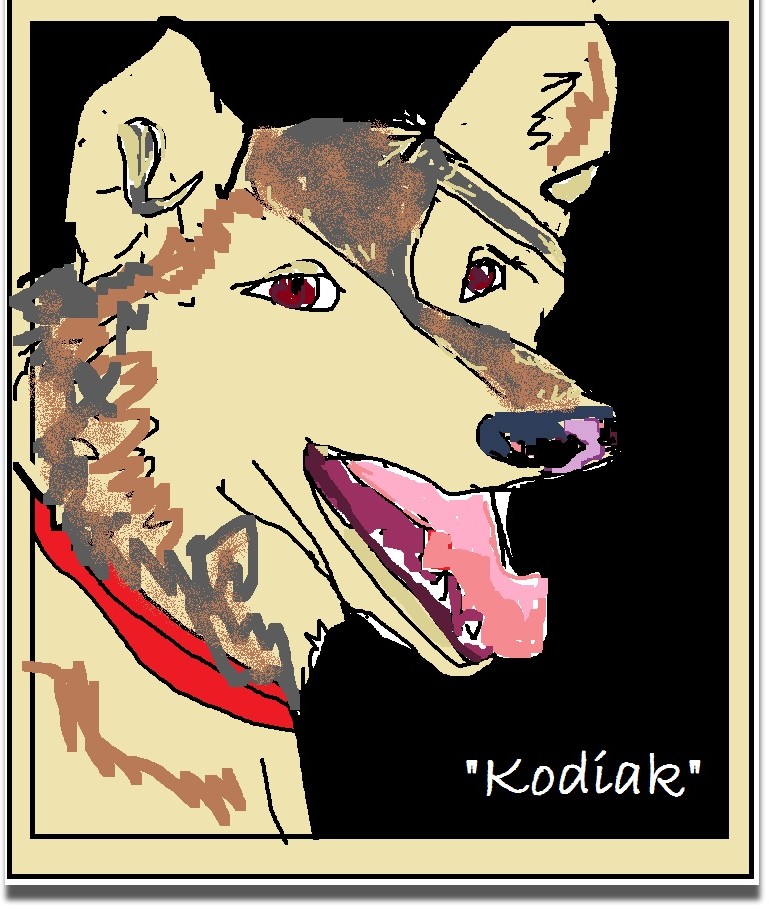
Coming into their own are boys Woody, Kodiak and Commando.
ChaCha's daughter Olivia, mother of Chena is very proud as Chena was in lead in her first race, the 50 mile
"Solstice" competition, Chena shows her long legs to advantage stride
for stride - here emerging from the darkest day of the year prior to her
race. Wearing her Mother Olivia's favorite layered look!
And some determination, too. And for her next challenge, she was
in lead all the way through the Two Rivers Dog Mushers' 200 miler,
moving up from 27th place to 9th place, finishing with a 50 mile sprint
to the finish!!! OMG!!! Chena in lead with Lester again -
this time on the Yukon Quest 300!!! And thanks to the SP Kennel
mushers, Chena given a chance to run the Iditarod XLIV with...Quito, who
most generously shared her knowledge and experience!!! Thanks so
much, Quito!!!
Next line down is the crop of 2015 puppies: On the left, Olivia's
(Coffee Litter) and on the right, Quito's "Golden Harness Litter" are
coming up later in 2016 for their first birthday!

IN THE KITCHEN LOOKING FOR TREATS (
"MEOW - NOT FRUIT AGAIN"?)


Not from life, graphics from many photos over the years stored in
our mind's eye of political animals; CHARLIE (second from the
right) AND LAST ... SEATTLE SALMON -
ALASKA SALMON story;
Right smack in the middle..it's a bird, it's a plane...it's a
drone? And I couldn't pass up kitchen scene "in the kitchen..."
(even if I didn't have any of my art
materials - I used a pen) of my Mommy and her best friend, orange
pussycat Charlie, who came to visit and decided to stay and protect her, above.


What was wrong with these early watercolors? Plenty. And a very, very early
experiment
from my own photo of the bust of Alice Delamar in Weston Library;
being taught a new golf grip (which didn't work for me, as it
happens); and, well, it was quite a large
sheet containing the full figure, and when I looked at it (20 years or
so after I'd painted it in
the first place) it was very busy - more than it needed to be. And
I did do more than one, IIRC, getting the pose more accurately drawn in
the second version. I always liked this next one of a ballet
pose.


These were very interesting (left two - precursors of graphic technique!) - only in watercolor can what I obviously
considered a "failed" painting look so good!
Doing the model's
hands is always a challenge - if you don't get it right immediately
(their initial placement) it will be tough later on...because it seems that
while models spot where they must place their, for example, elbows, on a
chair, it isn't so easy for them to be sure about each digit after a few hours posing!
Two-model poses are even harder in some ways...until you learn to work
on the whole painting/set up all at once!!!


Above, three examples of how I doodle. Sometimes you just have to
draw and paint - even when you forgot your brushes...which is what
happened here - or not, it was a long time ago!


And these three are examples of failed paintings that were still fun to do!
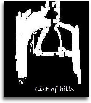
D I P T Y C H F O R U N I T E D S T A T E S S E N A T E

 T R I P T Y C H
F O R C A N D I D A T E S I N C O
N N E C T I C U T ' S 4 T H D I S T R I C
T 2 0 1 6 , 2 0 1 8


 N E W G O V E R N O R
N E D L A M O N T 2 0 1
9 . . . O N A M I S S I O
N
N E W G O V E R N O R
N E D L A M O N T 2 0 1
9 . . . O N A M I S S I O
N


 T R I P T Y C H
O F S O R T S O F " C
T T H R E E B R A N C H E
S O F G O V E R N M E N
T"


HIMSELF (c)
Previous Session and Legislature (2015-16) - and then the next Speaker (2017 - ) Speakers


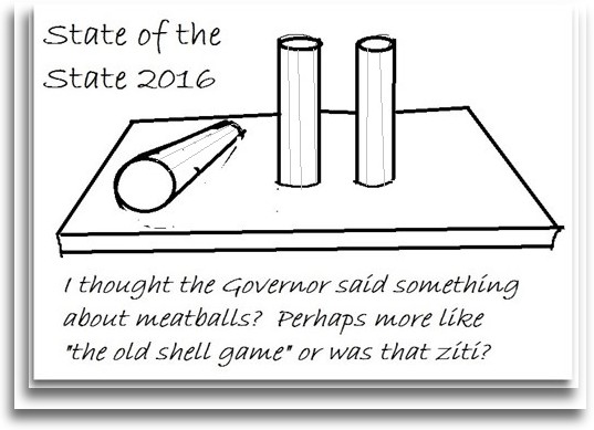
CINDERELLA TIME 2017-18:
Now that we are almost to the point
where a)Hartford the city is out of $$ and b)the State of
Connecticut is as well, got any bright ideas?
SO WHO WILL BE WATCHING THE STORE ONCE THE GOVERNOR AND THE LEGISLATURE NEUTER THE WATCHDOGS?
When is a cartoon actually a portrait? And when is a government sponsored work of art taken down? In Norwalk, when government is willing to spend funds to do so.
Triptych "Coming Up
In the Short Session 2016" features:
Executive Branch in the central panel, C.C.J.E.F. case's State's
attorney in right panel, flanked by the Speaker of the House
(Legislative Branch)
on the left!
Triptych "Going Into Extra Innings, Long Session 2017" features:
Executive Branch in the Central Panel, Sheff cases's State's attorney in
the right panel, flanked by the current Speaker of the House
(Legislative Branch) on the left!
ch
B U I L T E N V I R O N M E N T


LOOKING OUTWARD, CONNECTICUT (TOP)
How about the Information Superhighway and power and communication tools?
Interiors and reflections are challenging: How does the view
looking out, or the light coming
in - shadow and color - work for you? Make you run around in "circles" in confusion? And then there is texture and detail...by
the way, my favorite "model" is the Town of Weston - its land and town meeting form of government.


MORE DOORS AND WINDOWS AND FURNITURE - PAINTINGS NOT SEEN BEFORE
Did I mention that I like to paint architecture, both exteriors and
interiors? And also that government spaces can be good subjects
for interior views; I have included sketches of the Board of Selectmen
from
an earlier period (prior to this website development - prior to
websites, period)! This particular grouping includes previous
beloved assistant. Regarding this and the previous Boards of
Selectmen, so much was done to secure the passive beauty we enjoy
today! In the past, the Selectmen have done so much to keep my
favorite model, the Town of
Weston, looking as "rural" and as ideal as it does; will the new
"Strategic Planning Committee" destroy this? Stay tuned!
And of course, back to the art itself, observe how the significance of the
particular room or piece of furniture assists in catching the
mood! And light matters, and is the "star" of most all watercolor
painting. Windows are all different and it is fascinating to
observe
them closely to be able to simplify their part of a painting about a
building or a place...remember, these are paintings never shown - some for
good reason!
I haven't been able to conquer this
"illustration" art style, melding the figure into a milieu of a room or
landscape, yet. Perhaps because I'm not really interested in doing
so? Well, as it turns out, this art form is very similar to
watercolor in the respect that it was out of control until I worked with
it seriously for a year or so...as they say, that's how you get to
Carnegie Hall (which is just down 59th street from the Art Students'
League)!
After a year or two, I feel that I have created a new medium for myself!


You may have noticed that
landscapes do not appear in abundance here in my "Second Chance Portfolio (c) 2015."
Why? Works that I frame and show are...almost all
landscape...and architecture.
But some are here. Why? Because they are flawed
painting, for one. And I'm just now exploring the
technique of graphic landscape art. What does Pavlov Volcano in
Alaska have in common with fireworks or other events? Memories
stored of Seattle
and awesome natural features jump off the screen. Another caveat
on framing work other than landscape
is that you
don't want to
offend people with politically charged work that is either too strong a
comment or perhaps not clearly focused enough if you are intending to
sell it! So, especially in watercolor, why take the time and
effort to frame it!
A second wash of a watercolor, quite literally,
below, illustrated what I
learned from what is my favorite painting, "After Kensett," (2003),
above.
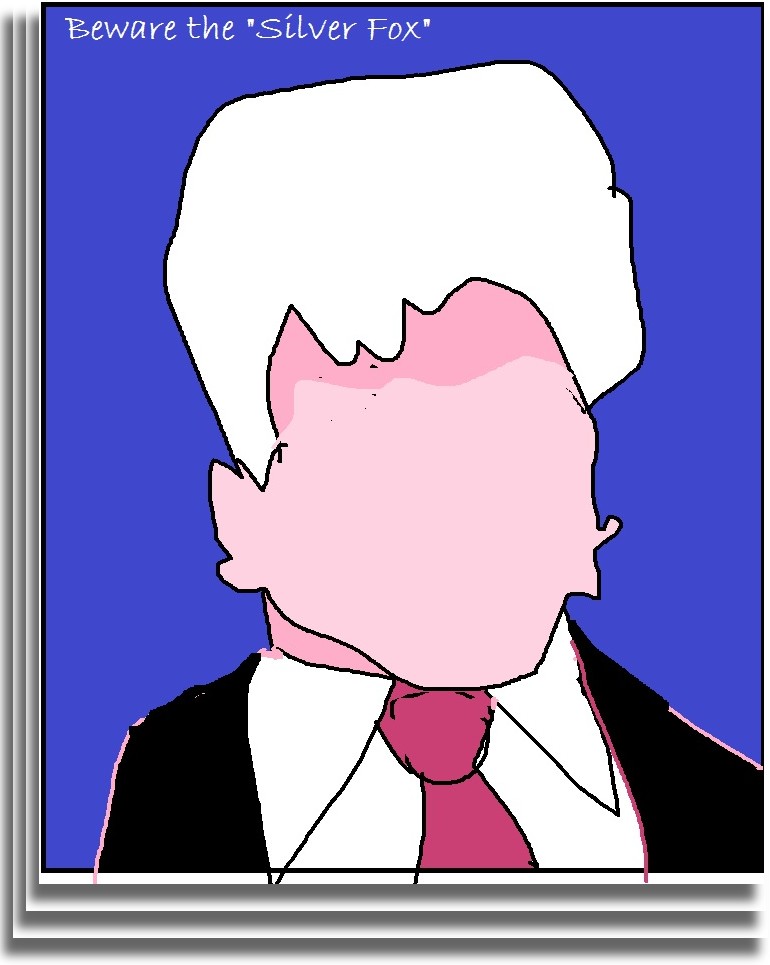
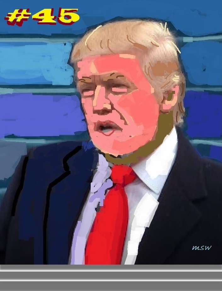
P O L I T I C A L A N D O TH E
R C A R T O O N S ( C L I C K T O
E N L A R G E )

2019: In CT, it is a new day...or is it?
-------------------------------------------------


WHERE IDEAS BEGAN: ELEMENTARY SCHOOL, DURING THE
DAYS OF "TAKE-COVER DRILLS" AND LINING UP IN THE HALLS, AWAY FROM
WINDOWS...(L-R)
No examples extant of our early cartoons, but
if
memory serves, we did a wicked Khrushchev! We
moved on to journalism. Cartoons can also make
sharp social comment without being "political cartoons." Without words.
And new for 2019...


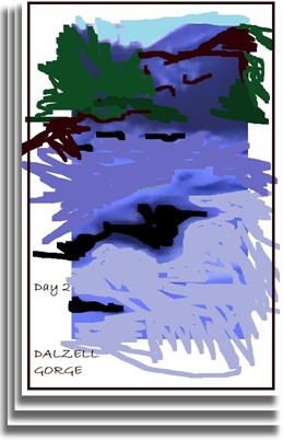
T R O U T B R O O K V A L L E Y 2 0 0 9
NOW AVAILABLE as a signed and
numbered print - "Is That Vermont I See?" second wash - it does not
exist as a watercolor because it was replaced with a third wash as well
as brushwork.
I N T H I S D A Y O
F G R A P H I C A R
T V I A C O M P U T E R . . .
T W E N
T Y - F I R S T C E N T U R Y
L I T H O G R A P H Y - C L I C K
T O E N L A R G E
A N D A N E W P O I N T I L L I S M


Chena's marvelous adventure! From her first big race (TR 200) to... Iditarod #44!!! WOOF


Black and white as well as halftone and grey scale make bold
statements - suitable for almost any bold topic. Or two or
three...


Weston Town Hall and the "Greensward" has been a favorite subject for
watercolor for me over the years. Now graphic art in play!


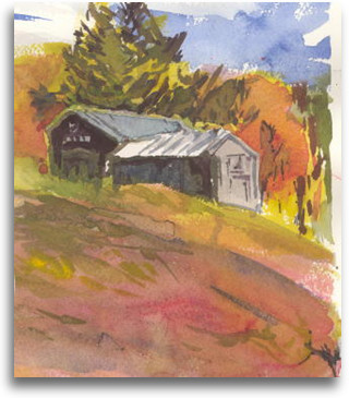
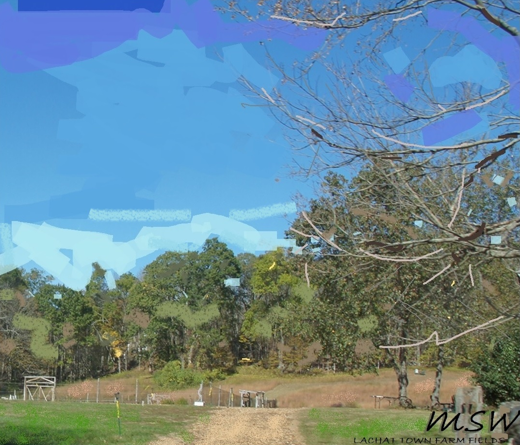
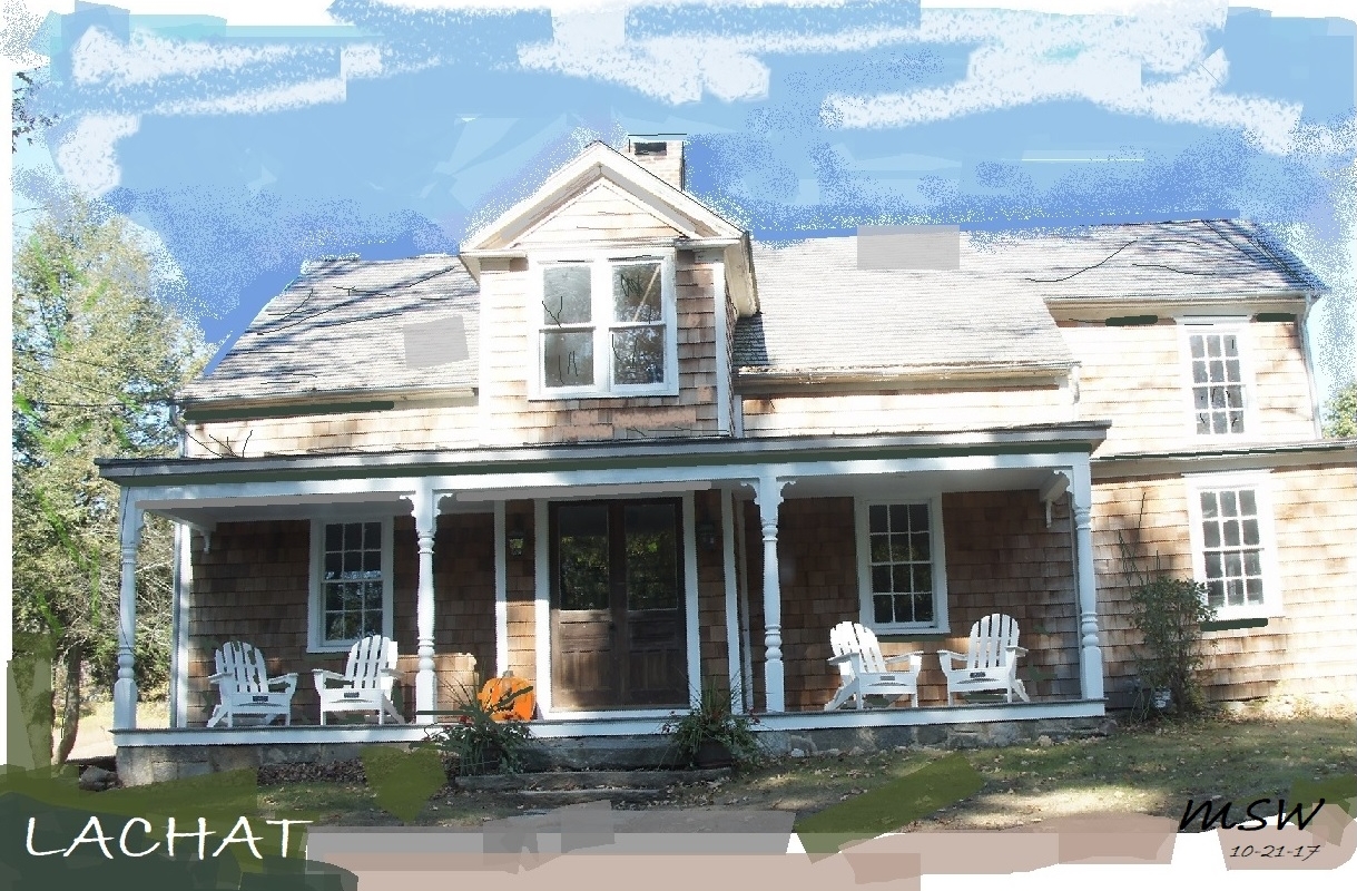
LACHAT - barns and more barns, fields and depicting it over the years and in different seasons as the personification of Weston!


Ode to Maillot. Grand landscape (or streetscape, for that matter) first enthralled me
via studying the works of others, and then I found my vision!


 When all is said and done, after a good friend, it is still-life that is the true test of the
creative mind. At right, "After Peto" - this Trompe-Loeil is
arguably a still-life, too! "Thanks ALT - Belknap 38"
When all is said and done, after a good friend, it is still-life that is the true test of the
creative mind. At right, "After Peto" - this Trompe-Loeil is
arguably a still-life, too! "Thanks ALT - Belknap 38"
WE ARE NOW (END OF 2018) IN A NEW DIMENSION OF POST-IMPRESSIONIST REPORTAGE
Experimentation with the medium is advancing. It has now
achieved perhaps some measure of competence and control.
- It began as computer lithography. First came familiarizing myself with tools at hand.
- Next came developing techniques for self-expression moving from photography into editing.
- I am convinced that this is a serious method of
self-expression. As such, the resultant "graphic" work is
satisfying to me.
- Recently, a few more outgrowths of "graphic art"
developed are: making a collage out of photographs of an event
and...political cartooning...the Daumier effect!
It is now morphing into its next phase. Interestingly (to me, at
least), my innate preference for pure color is evolving into a test
of creativity, with each work having a "limited" palette.
This is because editing out elements of one's own photographs is not
supposed to be a "crutch" as my favorite teacher once said. I am
now beyond the initial phase of use of this new medium.
Painting what I see and not what I think I see always made my watercolor
work verging on the inscrutable. The graphic technique stresses
the importance of each and every "marking."
More "tricks of the trade" plus decorative art ideas as well as an e-collage!
As a new "graphic artist" I call my works "new" Pointillism.
Maybe I was always bound to end up doing this work, in any event, it all
began as political cartoons in 5th grade, "portraits" during the summers and now on the fly, as the C.G.A. rolls along.
CONNECTICUT AND WESTON


DURING THEIR FIRST YEAR MANY THINGS WERE ACCOMPLISHED.
CLOSING VALLEY FORGE ROAD FOR A MORNING FOR FREE-WHEELING RECREATION, A
NEW IDEA (VIRTUAL NET METERING) PLUS (C) NEW TOWN ATTORNEY AND NEW IDEAS (ABOVE)


THE BOARD OF SELECTMEN 2017-2019
WESTON SELECTMEN MAKE PLANS FOR THEIR TERM OF OFFICE ABOVE...
SEATTLE


PARIS


HOW TO DO IT...
NOVEMBER 2019: NOW WE ARE INTO THE NEXT BIG THING -
UNDERSTANDING WHERE OUR OWN ART ON THE COMPUTER FITS INTO ART HISTORY!
P A I N T I N G L I K E A P O S
T - I M P R E S S I O N I S T O N T
H E C O M P U T E R
What does all art have in common?
Editing nature. Editing oneself. It is easier as we accept
the fact that what might have been a weakness in watercolor previously
is now our strength.
Into the new year of 2018, I am learning the artistic variety for "mark
making" available in my new medium. Art is where you find
it.
Previously...more than two years ago...
What do you do when you get to a point, no pun intended, where you
have reached the end of creative activity in a medium? Try
something new!!! In my case, it is combining my own photographs of
places and times with computer art.
Is the result similar to any other medium with which I have become
familiar? All of them - except watercolor! Watercolor is
most unforgiving, while oil or pastel are not. And this form of
computer art is even more flexible.
But to get to the "point" where painterly Post-Impressionism became
scientific color analysis, as it was in Pointillism, it took a while, at
least for me. Was this "art?" Well, I think
so. And I am only using my own photographs to start from.
Mid - 2019
P A I N T I N G L I K E
A P O S T - I M P R E S S I O N I S T I
N T H E L A N D S C A P
E V E R N A C U L A R . . . C H E C K T H E
" B R U S H W O R K " O R " M
A R K S "

FEB. 2019: And now we are painting like a post-impressionist who makes graphic statements!
Previously...


Whidbey Island


By 2018 Autumn we are back to our own sensibility - not feeling
obliged to render our own photographs, but rather simplify. To find the
"star" of the picture and make it new and...different type of visual art
- online newspaper!.


Mid-2019


2020


Previously, painting on the computer like a Post-Impressionist seemed to
be the mode...but now we're softer...more like Impressionists?


 Just prior to SPEAK UP 2020

Northeast corner beauty...


